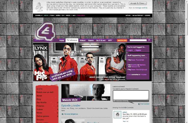
- Heavy use of images relating to episodes and cast members. Used to allow the viewer to recognise characters and navigate the page more easily.
- Character line-up placed in a large image at the top of the page. Used to indicate that they're the main characters and most prominent cast members.
- Each image is accompanied by some sort of tagline followed by a description of the content is leads to/is displaying. This is a great way to improve the page and make it a lot easier to make links and access different features easily.
- Images used to aid the navigation around the page and any additional pages that are connected to the site. Taglines are often links to another section of the site.
- Date underneath the main image states the airing date allowing any viewers that do not know when to tune in, when to turn on the channel.
- Sponsors' in the corner of the image, in this instance LYNX. This relates to mainly young males. A large part of the shows audience.
- Speech bubble on the right side, this allows visitors to leave a comment and broadcast their opinion about the show. A good feature in letting our audience know that they're involved and that their opinions are valued.
- Underneath the comment box, there is comments that have already been posted. This would allow the producers of the show to hear their audiences views and take note of things they like/don't like.
- Sidebar containing links to various sections of the site, such as 'about' 'blog' and a link the 4oD, allowing visitors to watch episodes if they wish.
- A 'like' button linked to Facebook, builds and expands to a larger fanbase which is connected by various different formats. This would be useful for us, as we're young an familiar with such social networking sites and how they work.
- Also a twitter page link. Again expands the shows influence.
- Ability to buy merchandise from the show is underneath the links to the social networking sites. Probably because younger people are more likely to respond due to their association with Facebook and Twitter.
- TV listings tell the viewers when the next episodes will be aired. Suitable for people who do not currently have access to a TV.
- Channel logo (E4) at the top of the page indicates the shows affiliation and what channel it can be viewed on. Also is spray painted which links with the idea of crime. (characters doing community service)
- Basic theme. Relates to how the show is presented. Rough and gritty, also quite dark. Used to add authenticity to the show and website.
- Some sidebars/boxes are in purple and white. The colours of the channel the show is broadcast on.
- Warning to underage viewers underneath the main image. Warning them of strong language and adult content. Therefore showing its audience is predominantly over 18.
Sunday, 11 November 2012
Website research - primary production research
Subscribe to:
Post Comments (Atom)


No comments:
Post a Comment